Showing posts with label Architecture. Show all posts
Showing posts with label Architecture. Show all posts
Tuesday, December 20, 2011
Josh Vogel's Reflections On Turning Wood
Josh Vogel from The Scout on Vimeo.
This video was produced by The Scout on Josh Vogel of Black Creek Mercantile & Trading Co. Released this past fall and beautifully done, I have watched it many times and have recommended it to many people. Everyone comes back to me saying how much they love it.
What makes this video so special is how eloquently Josh talks about his relationship to the material of wood that he uses in his craft of turning. In a time when most people are so disconnected with the work they do daily, it is refreshing to see someone who works thoughtfully and with intention.
Enjoy.
Wednesday, May 18, 2011
ICFF 2011 - Part Three

Part Three of ICFF Coverage -
Timorous Beasties!!! I love this new collection of Nottingham lace. This company exploded onto the market with their wallpapers and I am really impressed with the textiles they are producing.

I also love this Wool Voile Collection. The patterns are incredibly interesting. The influence is from traditional designs but Timorous Beasties put such a perfect dark modern twist on them. I hope that I have the opportunity to visit their factory or studio someday.


Part Four to come...
Tuesday, May 17, 2011
ICFF 2011 - Part Two

Part Two of my ICFF review- As I mentioned in the earlier post, my photos didn't come out great. Here is a continuation of my notes, in no particular order.
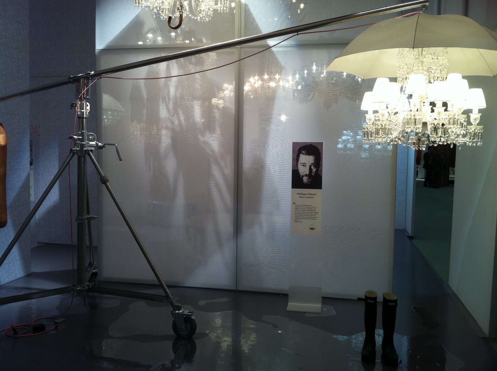
I love the above set up for Heller. This backdrop image of Frank Gehry cracks me up! The booth was simple, but effective. Ironically, this collection isn't my favorite work by Gehry. It is made of roto molded polymer, which is a great material for outdoor furniture. I find that some of the forms look outdated. But, hats off to the display!

 |
| Photo taken from Rapture & Wright website. |


Manulution uses traditional hand carving techniques from Bosnia and Herzegovina, which is shocking because I thought the carving details were all done on a CNC! Whoever is doing the carving is immensely talented. Unfortunately, a lot of the furniture line is overdone. The carving should be the highlight, but it often gets over shadowed by the billowing edge shapes and busy metal bases. Although, I am excited by the line's mix of tradition and craft with a modern sensibility.

I will continue, tomorrow, with Part Three of ICFF.
Monday, May 16, 2011
ICFF 2011 - Part One

I try to go to ICFF every other year to see what is happening in the USA furniture market. Some years are better then others. This year was neither here nor there. The satellite venues, throughout NYC, have been gaining momentum over the past few years. More of the experimental pieces and installations are being shown at the satellite locations then at ICFF. This isn't a bad thing. It is now defining how designers want their work to be received. ICFF is geared toward the professional Interior Designer, Architect, and Manufacturer. When at ICFF, its about the business of furniture. ICFF also guarantees that a lot of people will see the work. The satellite locations have a smaller more personal feeling and allow the ability to have a more expressive display of design. The work isn't confined to a booth. The environment (store or gallery) becomes part of the whole experience of the work. I didn't have time to explore much of the satellite locations. I wish I could have stayed for several days to explore all the venues. There is so much to see during design week. I was able to go to the Matter opening last night, which was wonderful. I will post about it this week. Below is Part One of highlights from ICFF that I found to be interesting. I should mention that a lot of my photos came out kind of crappy. I'm willing to blame it on the convention center lighting and not me or my IPhone 4. In no particular order -


In a completely different take on stools, here is a set by Tucker Robbins, the notoriously zen designer. The texture of the weaving on the bases is really interesting. The color choice also works well with the tone of the wood.


Part Two of the ICFF review will be coming up later today.
Monday, May 9, 2011
Knoll Textile Exhibit At Bard Graduate Center

The exhibit, Knoll Textiles 1945 to 2010, is on view at the Bard Graduate Center from May 18th to July 31st. The show will be covering the history of Knoll's textile division. It ends up that most of the Designers were women. I plan on going to see the show. I am surprised that the opening is after ICFF, International Contemporary Furniture Fair, when most people who would be interested in the show will have already left town. Odd choice.
In the Chaise piece above, I used a traditional Knoll Boucle in Cayenne. Knoll fabric is a joy to work with. Its durable, thick, and easy to sew. This piece was made many years ago and shows no sign of sun fade or wear. I'm more concerned with the foam breaking down before the fabric gives out. Whenever you see an old Knoll furniture piece, usually the fabric has lasted strongly and is just in need of a good cleaning. Knoll has always understood what it takes to make a high traffic piece last. While over the years I have studied a lot about the company's furniture, I welcome the chance to learn about their textile department.
Monday, May 2, 2011
Blacksmithing Class Number Seven & Eight


This is my final product! Every tool box should have one and I never bought one. So, I'm excited to now have one I made. Anyone need something chiseled?
I wish I could give a link to Jonathan Nedbor, our instructor's, work. Unfortunately, he doesn't currently have a website. Once he does have one, I will update this post with the information. Jonathan owns Canal Forge in High Falls, NY. I highly recommend taking a Blacksmithing course with him. Besides being a great teacher, he is extremely talented and very generous with his knowledge!
Monday, April 4, 2011
Salvador Dali Museum in St. Petersburg, FL
In preparation for my trip to Florida, since I knew that I would be going to the Salvador Dali Museum in St. Petersburg, I downloaded Un Chein Andalou on NetFlix. I thought it would get me the mood for going to the museum. This movie, by Salvador Dali and Luis Bunuel, was thought to be shocking when it premiered in 1928. Seventy plus years later, and it still has an air of shock, humor, and the absurd.


Since a business trip had me in the area, I drove there after going to see the BOK Tower Gardens. The building is striking in person. I walked around it and there are interesting views from every angle. They also did a good job of landscaping the grounds around the public space.

Costing a mere 28.5 million dollars (ha!), it took three years to construct. The juxtaposition between the concrete and glass makes sense in relation to Salvador Dali's work.
 |
| Image via Google Images |
He often had these balances between hard lines and soft or melting images. I think he would have approved of the absurd placement of the bulbous glass forms.

This is the only photo I got from inside the museum. One of the guards hunted me down and told me no photos are allowed to be taken inside. While I really like the exterior of the building, I am disappointed with the interior. The stats list that the interior is 68,000 sq ft. It is hard to imagine that is the actual size. When you first walk in, you enter through the gift shop. It seems inappropriate. You think you are there to see art, but you immediately feel like the museum has nothing to do with art and only with pushing merchandise. Then, you have to battle your way through the store to get to the counter to buy your ticket, which costs $25.00! I know they have to pay for the museum somehow, but it felt over priced; especially when I discovered that the galleries were only on the top floor and maybe covered 20,000 sq ft.
I was happy to see such a concentrated amount of Salvador Dali's work together. I have always been on the fence with his work. Sometimes I love it. Sometimes I hate it. What I did love about one of the galleries is that they showed his early work when he was a teenager. You got to see him trying out different genres and practicing his technique. It was tight connect to the large masterpieces he did later in life.

There is a living wall installation on the way into and exiting the gift shop. I mean museum...
Overall, the building by HOK does stand up to the positive press it has received. How the museum is set up and run stands entirely aside from the structure, but does impact a visitor's experience with the building.
Friday, April 1, 2011
Blacksmithing Class Number Four

Now that I am taking this blacksmithing class, I am noticing ironwork everywhere! This gate is at the BOK Tower Gardens in Lake Wales, FL. I visited the garden, recently, while in FL.

The gates were designed and built by Samuel Yellin from Philadelphia. His granddaughter, Claire Yellin, still runs the business he started. The company does conservation, restoration and new work.

Detail of the latch. This is the notorious shot that almost got me bitten by a swan.

Detail of the end of one fence.
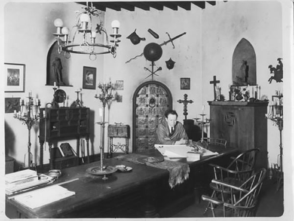 |
| Mr. Yellin in his office. Photo via http://www.samuelyellin.com. |
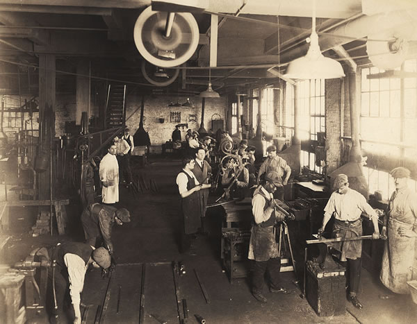 |
| Yellin Forge Shop. Photo via http://www.samuelyellin.com. |
I love these old photos of people working in shops.

Tuesday, March 29, 2011
BOK Tower Gardens in Lake Wales, FL

After leaving Daytona, I headed over to Lake Wales to visit BOK Tower Gardens. Located in central Florida, this National Historic Landmark is definitely off the beaten path. Since I have a love of architecture and historic buildings, I was determined to visit this place before I left the state. I make a habit of visiting as much interesting architecture and landmarks as I can when I am traveling for work or pleasure. It is amazing how many landmarks exist in the USA and how many are in disrepair. Fortunately, BOK is listed as a National Historic Landmark and receives federal money to assist in the maintenance and upkeep of this beautiful tower and gardens.

BOK Tower was conceived by Edward Bok, a Dutch born American, who was a wildly successful editor and Pulitzer Prize winning author. He built the Singing Tower in 1929 to give back to the people of America. To read more about Bok, click here and here.

The Singing Tower was designed by architect Milton B. Medary and made to house a Carillon. The gardens surrounding the Tower were designed by Frederick Law Olmstead Jr.

There was an air plant exhibit at the gardens. They strung the plants with wire which made them look like they were floating in air. It looked really dynamic in person.

A section of the visitor center had a path where stones were set into concrete on end. The stones were sticking up about 3/4" from the concrete. It created a neat visual rhythm and felt good beneath the feet. If I had been barefoot, I might have felt differently about it.

Attached to the Tower and gardens is the Pinewood Estate. I took a tour of the house and the kitchen had this great overflow design in the kitchen sink.

Outside the house.

Tile fountain in the courtyard.

Walled garden attached to the dining room of the house.

Beautiful blooms while walking the grounds.

What is Florida without some oranges?!

Throughout the gardens are these rubbing stands. You place paper over the tiles and rub the image onto it. It's a fun detail to find throughout a walk of the gardens.

This view shows the typical English landscape style of the Olmsteads. However, to see it with South East trees and plantings makes it very different then the typical North East ones I am used to seeing, like the one below.
 |
| Boston Public Garden photo via http://www.imaginativeamerica.com/tag/parks/ |

And finally, here is a picture of one of the swans that tried to bite me while I was taking pictures of the Tower. Aggressive little suckers... Just as I yelped and jumped back from the blaring teeth of this bird, a group of white hairs exploded in laughter. Have I mentioned that when I go to visit these historic places, I am the youngest by about 40 years?! They're lucky my parents raised me to respect my elders or their canes would be floating in the water here....
Subscribe to:
Posts (Atom)


